As an example of how you can use Market Correlation to your advantage, below we have two charts: one on the USD and the other on the Swiss Franc. They are both NinjaTrader charts with indicators from Trend Following Trades; one of our alliance partners. These two currencies are reverse correlated meaning that when one goes up, the other goes down. The indicators should make this clear to you.
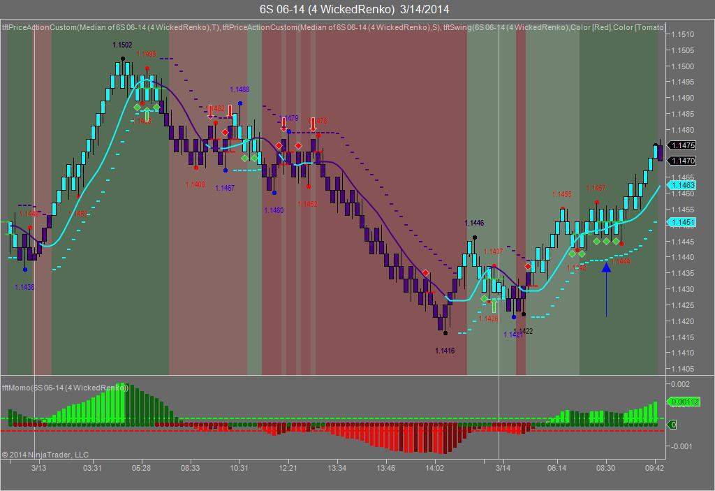 Swiss Franc – June, 2014 contract – trade date: 3/14/14
The above chart shows the Swiss Franc on Friday, March 14th. It shows an up arrow at around 8:30 AM EST. So how would you know that this was a long position and when to take the trade?
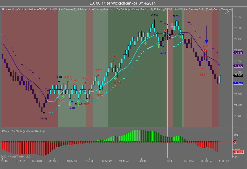 USD – June, 2014 contract – trade date: 3/14/14
The above chart shows the USD on Friday, March 14th. At around 8:30 AM EST it shows a down arrow, indicative of a downward movement. When the USD goes down, the correlated asset must go up. Could you capitalize on this trade? As a trader you could have made 20-23 ticks on the Swiss Franc. Each tick on the Swiss Franc is worth $12.50 per contract traded. You do the math. This is an example of what we provide each day to the subscriber for the previous day. It’s an example of how you can benefit by using Market Correlation. BTW – we provide this each day because each day you will experience a similar movement between the USD and the Swiss Franc.
As a Market Tea Leaves Subscriber you’ll also receive trading videos on how to use Market Correlation in action.